BRAND DESIGN
PCIT
I was charged with designing a mark that 1.) followed our template for internal logos, 2.) stayed true to the Nationwide brand strategy, and 3.) was unique. The Nationwide blue square resembles the Nationwide frame mark. The segmented grey square represents technology and the negative space created by their union represents how Nationwide and technology come together under this group. 2007

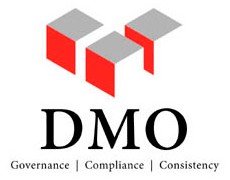
DMO
DMO wanted a mark that represented the three facets of their group: governance, compliance, and consistency. I played on a "building blocks" theme to create a mark that showed the three consistent building blocks of their group. The three colors reiterated the three components of the group and the negative space allowed the mark to "breath" while giving it a clean and streamlined feel. 2006
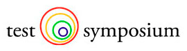
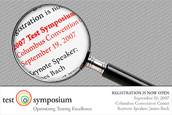
Test Symposium
The Nationwide Test Symposium was a one-day conference mainly dealing with software testing. They chose this mark because it conveyed magnification, attention to detail, and variety. 2007