Typographic Specimins
Your choice of typeface is vital
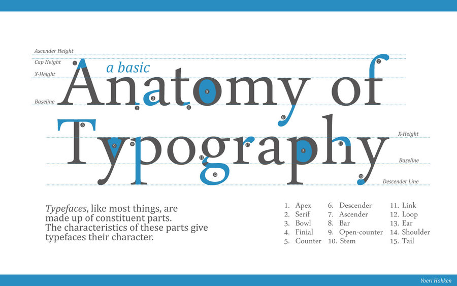
Typography can change the entire look and feel of a presentation. A good typeface will attract and hold the attention of the viewer. When used correctly a certain typeface can also convey a specific mood of feeling. If you are not careful or uneducated in the matter, you may choose a typeface that does not correctly portray the piece of work.
More on typeface choice
A few more reasons why choosing the right typeface includes the fact that it helps to establish an information heirarchy. By using different sizes of the typeface, the audience can determine which parts of the piece are most important just by looking at it rather than reading it. Which in turn makes it easier for the audience to pay attention and follow along.
Choosing the right typefaces are also very important because sometimes they are the only visuals your audience will remember most. You want the audience to be able to recognize your brand, presentation, website...etc. The viewer will identify with the typeface over and over again. One of my personal favorite typefaces is Eurostile
Importance of line height
Line spacing, or "leading", is the amount of space between the baselines of each line of text. Correct leading is important because it gives multiple lines of text optimum legibility. For web design, it's called lineheight and is measured in points or percentages of the text size. There are certain fonts that will be effected differently when chaning line height, such as Bernhard Modern.
Line spacing, or "leading", is the amount of space between the baselines of each line of text. Correct leading is important because it gives multiple lines of text optimum legibility. For web design, it's called lineheight and is measured in points or percentages of the text size. There are certain fonts that will be effected differently when chaning line height, such as Bernhard Modern.
Line spacing, or "leading", is the amount of space between the baselines of each line of text. Correct leading is important because it gives multiple lines of text optimum legibility. For web design, it's called lineheight and is measured in points or percentages of the text size. There are certain fonts that will be effected differently when chaning line height, such as Bernhard Modern.
- Readable Fonts
- Non Readable Fonts